 |
Go 2 And they were saying, "Well, can't we put XTC really big at the top?" And I said, "No, that takes away from the whole purpose of the actual design being all that white lettering." You know, if you look at it at twice arms length it just looks like static. It looks like just black and white static. It's beautiful. ~ Andy Partridge |
|
On September 12, 2002 ~ Andy
and I chatted about the cover of XTC's second album.
|
|
WL: Well, then you have Go 2. Which I always thought, "Okay, this is the first XTC cover that is just - groundbreaking." And then, years later I find that XTC didn't have much to do with that cover. AP: We didn't, no. We were told by Virgin to go and get professional sleeve designers. And to go and see Hipgnosis, who were - I guess, at that time they were kind of on their way down as big groovy sleeve designers. And I think they welcomed us because it was a new band and so new blood, and it was going to carry their torch onwards. We went for a meeting with them and they laid out all of the ideas they'd worked on. They were stock sort of stuff that they'd put - you know, they had an idea and they did it and they would say, "okay, we'll keep that in the drawer." |
|
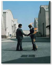 |
WL: Pick your cover out of a catalog. AP: Yeah, it's like the catalog, and you show these ideas and the band might like one of them. So it was all the usual, kind of parade of stuff. There's people dressed up as mummies, kissing. WL: Seems like a very odd way to choose cover art. AP: Yeah, it was. You know, there's lots of people on fire shaking hands with each other. All that sort of shit. WL: Pink Floyd grabbed that one. |
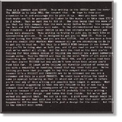
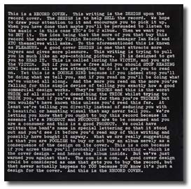
| AP: That kind of stuff. And to be honest, it really - all this stuff they laid out on the floor of the office. My heart sank and I thought, "Oh, Jesus." And we're kind of being obliged by Virgin to pick something from this pile of shit. [laughter] And I really don't like it. And I still wanted to carry on the black and white, strong sort-of simple kind of graphic thing. 'Cause I thought we hadn't wrung all the goodness out of that. We hadn't wrung all the monochrome-marvelousness out of that. [laughter] And the stuff that Hipgnosis were showing us I really didn't like it. And I was feeling pretty depressed at the end of the afternoon. And it was a case of, "Well, uh - you know, we'll let you know which one then." And as we were walking out of the office - the office was a big high, sort of Victorian room and they had a huge fireplace at one end - you know, not working or anything. And on the mantelpiece of this fireplace they had a twelve-inch sleeve, just covered in writing, saying [click to view the actual cover] "THIS IS A RECORD SLEEVE, THE PURPOSE OF THIS SLEEVE IS" - blah blah.You know, the whole thing. |
|
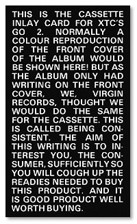 |
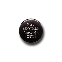
And I said, "That's good" and lifted it off of the mantelpiece and started reading it. And I said, "This is great - what's this? - have you done this for somebody? This is great!" And they said, "Oh no, that's the office joke. We did that as a joke to show what the ultimate sleeve could be, and of course nobody will touch it! We've shown that to every band that's come in and that is the one they reject." [laughter] And I thought, "This is it! I want this one!" Knowing that everyone else had rejected that. That was at the bottom of everyone's list. And to me, it was like - it just seemed to sum up what a sleeve should do. And I said, "We'll have this," and they didn't take us seriously. They said, "Yeah - sure - okay - so you're gonna ring us about which of those sleeves you want?" [Andy] "No, no. We want this one!" [Hipgnosis] "No, no, c'mon. You can't have that one it's a joke you know. It's our office joke. We leave it there on the thing as a joke. It's our office gag." [Andy] "No, no, this is what we want. We want this one." And we made them do the whole thing, you know, they printed up promotional T-shirts saying "THIS IS THE T-SHIRT - THE PURPOSE OF THIS T-SHIRT - THIS IS THE BADGE - THE PURPOSE OF THIS BADGE," blah blah. That sort of thing. The ads in the paper - you know, we took it the whole way. WL: It's a great gimmick. |
|
AP: Yeah. And I liked the fact that nobody else wanted it. I mean everyone had turned it down. Pink Floyd had turned it down. I kind of liked that. I liked the fact that it was the complete and utter joke. And the office new it as well, it was their joke because everyone had rejected it. WL: Did Virgin react well to the idea? AP: I think they were a little bit "Uhhm. My God, are you sure this is going to work?" And they were saying, "Well, can't we put XTC really big at the top?" And I said, "No, that takes away from the whole purpose of the actual design being all that white lettering." You know, if you look at it at twice arms length it just looks like static. It looks like just black and white static. It's beautiful. And we talked 'em round and they went with it eventually. |
 |
|
|